The first thing your clients see about your web site is its logo. In the future, it will be like your own signature. It can be sprawling and memorable, sophisticated and striking, or even plain and boring – it’s up to you. If the first impressions are the most lasting ones, you do have to devote lots of your attention precisely to your future logo.
Logo Design Trends & Inspiration

Let’s take a look at 10 largest logo design trends for 2018 and you will understand how to create your own unique logo that will satisfy your web site’s needs.
The slogan of 2018 may be a Latin phrase In Omnia Paratus, which basically means Ready for Everything. Looking at the main logo design trends for 2018 one cannot deny the following fact: they are blended with each other and the more daring your idea is, the better it will suit the concept of 2018.
Minimalism in everything
One of the most significant trends in web design for 2018 is minimalism. No wonder that the same refers to logo designs. It is believed that the fewer, the better; and here is why: minimalistic design attracts more attention, especially if it’s made in a refined and engaging way.

It’s truly memorable and if your main task is to get recognized, minimalistic logo is definitely for you. Combined with simple colors and unique geometric lines, it is highly competitive and associated with fashion and creativity.
Take Facebook, Pinterest or LinkedIn: these web sites are the best evidence of minimalistic logos that work indeed.
Broken letters
If you’re looking for some really creative logo designs, make sure you don’t forget to check this trend out: broken letters won’t leave you indifferent.

Smart, twisted and mesmerizing: choosing this logo trend you gain a scope of creativity that will be highly appreciated by your web site visitors. Broken letters will be the best solution if you want to make your web site stay out of the crowd: it is smart, striking and widely recognized.
Bright color palette
The logo that cannot rivet any attention is a bad one, don’t you agree? Along with bright colors that are extremely popular in web designs 2018, bright palette is being used in logo creation as well.

Its hidden perk is concealed in the ability to impress your visitors: poison-orange, rich green or catchy red cannot be left unnoticed. If you’re keen on gaining your visitors’ attention, it’s exactly what you need.
Geometry
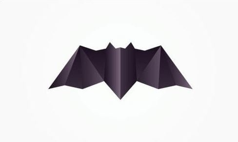
Geometry wasn’t just something you studied at school, it’s also the way to create a unique logo design, as far as it gives you plenty of opportunities: smooth lines, sharp edges or even the combination of both can do you a big favor: along with a splendid logo you will be able to use the same style in your web design model.

Geometrical principles can be used in minimalistic design or broken letters, it may contain bright color palette and therefore you can kill two birds with one stone: not only will you have a great logo but also you will receive a combination of several web design trends needed more than ever. This blending totally corresponds with the latest 2018 logo design trends.
Hand drawn
2018 is full of surprises. Hand drawn logos are one of them. Cute, inspiring and thought-provoking: they appeal to your users’ imagination. Their main purpose is to entertain your visitors who unconsciously will be drawing your logo on pieces of paper.

The most difficult in this case is to create such logo: even doodles must be carefully thought through. This idea is fresh and powerful, as far as it allows you to share your ideas with your clients from the very beginning of them visiting your site. Some say that hand drawings might look a bit childish but in fact they show your creativity and stress that you are open to everything new and daring in the world of logo designs.
Patterns

Floral, geometrical, animalistic patterns are on the top in web design logo trends 2018. They can reflect your web site’s content and therefore attract even more visitors. The idea isn’t new but the approach towards it is, namely the combination of patterns, e.g. floral and geometrical ones. Nevertheless, you have to be extremely careful in this case: if overused, such patterns will reflect the lack of taste and not its presence.
Moving parts
Can you imagine the modern Internet without any animation at all? Neither can we. The best about logo design trends in 2018 is that they give you a complete freedom in what to do and how to achieve it. Animations are no exceptions.
Moving parts in your logo are preconditions of a successful design concept: they differ you from your opponents who don’t use this kind of logo design. Such logos give you a chance to impress your clients by making them wonder: what’s going to be next?
Vintage

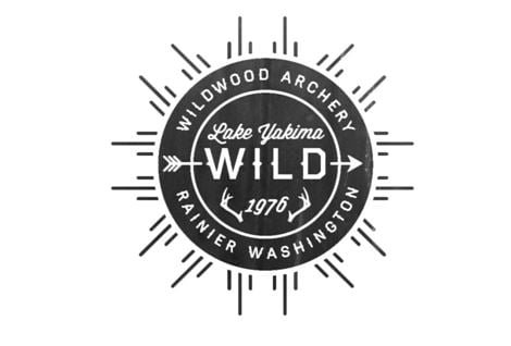
History repeats itself, that’s why one of the best trends of previous years does its encore again. Vintage logos are truly beautiful and sophisticated and will fit practically into any web design style. What’s more, they seem to reign among all the other logo design trends popular in 2018. Vintage means exquisite taste that spreads over your entire web site as well. Such style emphasizes your attitude to the whole project: everything must be done precisely in a refined way.
Half&Half

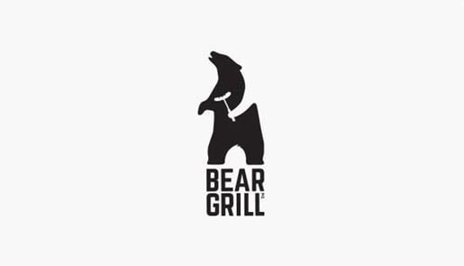
Symmetry is believed to be a pure perfection because it reflects a natural balance. Everybody is attracted to it. That’s why symmetrical logo design is a perfect solution if you want your logo to be appealing to your visitors. It goes with the rest of 2018 logo design trends like simple forms, geometry and minimalism and they also spicy up the visual impression of your logo by making it look smart.
Simple forms

Multiple and tricky forms are no longer in fashion. 2018 simplifies everything, including logo forms. Simple logos are easier to remember and therefore are better recognized. They make your logo sprawling and clever and they don’t demand overthinking. If beauty is in the simplicity, simple forms in logos are beautiful indeed. 🙂


1 Comment
Hey Harshil,
These are really amazing ideas regarding Logo design and you know people are also going with this trend for better visualization and results. I also like Geometrical idea to design logos and always shown positive result. Eventually, thanks for exploring.
With best wishes,
Amar kumar