Logos cost a lot – it’s a common fact. Their high price can be easily explained by their importance – the better your logo is, the more it will be recognized among your potential clients. As a result, the more clients you get, the more your income will be.
Most Expensive Logos In The World

It’s a simple Maths. That’s why logo expenses are worth every cent. However, not always. Sometimes companies spend a fortune on logo design which either looks ridiculous or could be done at a much cheaper price.
Here’s a review of the most expensive and inspiring logos in the world. Take a look and decide whether they were worth spending money on.
Symantec
Symantec is an American software company that deals with security, storage and backup of information. However, it’s famous mostly not for its successful business but for being a company that spent the biggest amount of money on upgrading its logo.
The company was charged $ 1 280 000 000 for the logo and we may only wonder if it was worth it. The logo itself contains a black checkpoint in an orange circle.

The pixelated part of the icon symbolizes globalization and the ability of the company to get merged and become a part of every person’s life. If we analyze the color palette of the logo, orange color will determine that the company is worth your trust.
At the same time black shows luxury and sophistication. There is also the name of the company underneath the circle done with the help of a creative font. The whole image is really great.
However, one may only wonder if the same logo couldn’t be designed at a much lower price. The new logo didn’t help Symantec become the largest software company in the world. On the contrary, the company has experienced a major recession.
BP Global
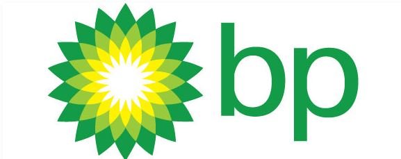
BP Global is one of the world’s largest oil conglomerates that’s why it was no surprise that such company has spent a considerable sum of money on upgrading its logo. Still, in comparison with Symantec, $211 000 000 spent by BP on the new logo seems to be a ridiculous amount of money. As for the logo itself, it presents a combination of green, light green, yellow and white.

Such warm color choice designed in a shape of a flower conveys an impression of a green outburst. Also, such colors are associated with environment, protection and growth. In such way the company establishes that it cares for the environment and its development is the main priority.
Another important detail of this logo is the name of the company, BP, placed above the flower to the right. Such placement of the text along with an interesting font makes the composition totally harmonious. Such logo was really beneficial for BP Global and nowadays the company is easily recognized by it worldwide.
Accenture
Accenture is a consulting agency, a leader in its sphere. It’s paid for its new logo $100 000 000 and this sum isn’t so impressive after Symantec and BP Global.
The new logo is very clear. Its designers (the same agency that created a logo for BP Global) decided to stick to a simple and yet smart solution: instead of emphasizing on the company’s name using some extravagant colors they used pure black and nothing more.

The idea seemed to be working: the usage of this color helps not only attract people’s attention but also keeps it. The only thing that was added to the company’s name was a special sign above the letter T (this sign was the company’s first logo).
Posten Norge
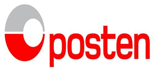
The Norwegian company Posten Norge that provides post services has got its logo at a rather large price: $ 55 000 000. The company used to have a plain and not engaging logo, that’s why a new one was a large success. The company used two colors for the new logo: grey and red, emphasizing on the last one. If grey is associated with security, red is for speed.

Both are vitally important for a company that deals with a fast delivery. To design this logo, they chose a clear font that can easily be read. Posten Norge gained a large profit after such re-branding, that’s why such high price was totally justified by the result.
Australia and New Zealand Banking Group
Having paid $ 15 000 000 000 for a re-branding campaign that included a new logo as well, ANZ showed they were totally open for changes. Two shades of blue were chosen to represent the company, along with the broken letters and a strange symbol that stands for Australia, New Zealand and Asia Pacific.

The company had broken letters on its logo before but this time these letters look much better from the design point of view. Also, there are two most popular colors used for banks logos in the whole world: green and blue, mainly because they rise the level of trust in their clients’ minds.
That’s the reason ANZ decided to pick blue as its company’s color: the same color is chosen by the biggest Swiss and Cyprian banks that inspire trust.
BBC
BBC is the biggest media conglomerate in the world that is considered to be one of the most trustworthy as well. Its current logo cost $1 800 000 and is one of the best examples for a prosperous logo upgrading. The logo consists of the name of the company in white written on 3 separate black squares.

Such colors mark that the information that is provided by BBC is unprejudiced and can be trusted. The font that is used for designing this logo is elegant and aimed at the visual perception of the whole picture. It’s hard to imagine a better logo for BBC. For now, at least.
As you see, logo design is essential for the company’s corporate identity, that’s why the biggest companies spend lots of money to stay in trend.
However, even a large sum of money doesn’t guarantee that you will get a perfect logo. If you want your logo to be outstanding, you should consult a lot of professionals in order to get a satisfying result.

