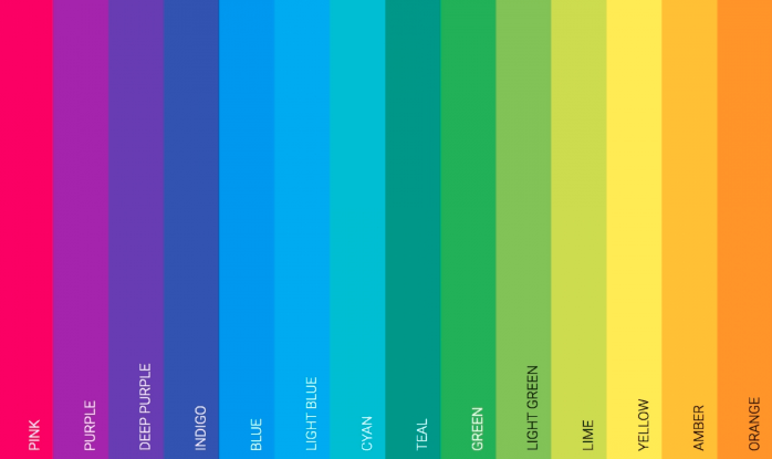
Scientific research has shown that colors and their usage can control how a person will think as well as behave. Also, you must’ve noticed this that people get more attracted to colorful images and bright themes than plain black and white.

Modern web design agency professionals carefully choose colors on the website to make it more appealing. Along with design and content, if the right shades of colors are used, it can help a lot in influencing people and winning marketing campaigns, feel SEO agency experts.
Now, why do experts emphasize on using the right colours on websites? Well, this is because of the following reasons.
- An attractively designed website will not only attract a person but also will give him or her subtle hints to focus on the little details and find the right kind of information that he or she is looking for. The perception of color is very important here. The motto of an advertisement including the underlying messages, psychology and the information are all portrayed well when the right color combination is used in the advertisement. A discordant effect is created when you use too many complimentary colors whereas analogous colors emanate peace and are more soothing to the eyes. Using colors that are soothing and not very bold or harsh will attract your audience more. Choosing the right color scheme is very important as is you go wrong it can single-handedly shoo away all your users.
- If you want to make your campaign successful you have to pay special attention to color combinations to make your users notice the elements on the page or ad that you want them to see suppose you want your user to look at your pitch or the element of call to action must feel different and all of this can be done with the help of proper color scheme. A different color scheme for these important elements will naturally grab the attention of your users. You can use red, green or yellow but then first know which one works the best for your website. This will also facilitate an increase in the number of conversions.
- Colors can be associated with emotions as different shades have different impacts on people. Some colors can persuade the user by poking their emotions. Generally, the color red is associated with love, white signifies peace, yellow is the color of happiness and everything bright, blue stands for trust and so on…You must have noticed that aristocratic brands use platinum and gold to showcase that they are sophisticated and luxurious. Colors help customers to make a decision on whether they’ll but your product or service or not. You have to first specifically understand who your target audiences are. And then prepare your digital marketing strategy.
- Choosing colour wisely is very important while planning an ad campaign that may be on your website or social media pages. A proper colour scheme will have a positive impact on a consumer’s brain which will, in turn, help the consumer to make a decision right away. What type of colour you are going to use must depend on your target audience say, for example, research shows that men are fond of bright, bold colors such as green while women like neutral or pastel shades more and the color purple, although this is not always true whenever you decide the colour scheme do it judiciously. The success of a social media campaign, specifically, depends largely on the colour scheme you are choosing.
- As a digital marketer, you must understand the importance of the legibility of the visual content that you are using for an ad campaign or on your website. You should not really use colours which are high-contrast say if you use grey on white your content won’t be clear… just try and see it for yourself and you’ll understand. Next is to make your text legible, so do not use a combination of dark green and blue or green and red or blue and red, so on… that’ll again be too harsh for the eyes. Your campaign shouldn’t strain the eyes of your target audience remember this. Some people find it hard to distinguish between red and green and that’s because of color blindness… consider this factor too. You have to make things easy to understand for your customers.

- B2C brands use the color orange look at Amazon or Nickelodeon or Harley Davidson or even Penguin Books, a publishing house, they have kept orange in their logos, and the question is why? Because orange is the color of warmth and is pretty bright, people distinguish orange as a very non-corporate yet elegant color which they connect to easily and same is the case with yellow. Again if you look at B2B brands they use blue because the color invokes a sense of tranquility, wisdom, truth and strength then blue is more B2B centric and definitely is more relevant. Look at PayPal, Visa, Nivea, and so on… they use blue more than ever.
- Okay, now you want to give a very clean and contemporary look to your brand and want to create an impression in the minds of people then go for silver on white just like Apple or Tesla or Zara. Purple, on the other hand, can be associated with something classic and best in class, for example, look at Cadbury, Hallmark, and so on… these brands are classic and have created an impression on people’s mind since ages.
If your brand exudes the warmth of festivity, pretty optimistic, happy, bright and everything good and vibrant then green is a great color to choose as it is considered to be the color of friendship, trust and authenticity. An Ad campaign must speak for itself and color scheme can do the talking quite adequately.
Colors can change a person’s perspective and that’s why therapists suggest adding colors to create a happier effect. This holds true in all cases – so colors, vibrant themes should be an important part of your digital marketing strategy as well.


