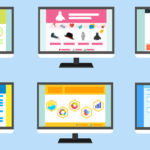
Websites Web Design Trends, As time changes, so do Web Design Trends. If you are a web designer, you must keep up with the latest trends in your Web Design for a successful Business score. Small yet innovative changes can create huge impacts and give your website the cool look you have always wanted. So let’s explore the latest 2014 web design trends!
Websites Web Design Trends:
What Suits Single Page Websites the Best?
Web design Trends doesn’t have much content to display, you can always rely on having a single page Visitors are less prone to get distracted due to an overload of links to other pages,and they will be able to scroll through your single page website easily. Your navigation layout should be easy to comprehend. Single page websites convey message in a more focused way. Just keep the content of your website brief and sweet and you are good to go.
Scroll all the way!
Almost each of us is the proud owner of a smart phone by now. Most of us prefer to do a quick research on our smart phones instead of going in to the trouble to open their laptops. Smart Phones have smaller screens, thus a user will have to scroll more and more to view the rest of the content on the page. Users are now more in the habit of scrolling, which means they will visit the entire web page. Keeping in mind their psyche, web designers should focus more on creating a layout which enforces the reader to scroll all the way from top to bottom. Make sure your web page is not too long, or reader will lose interest and will switch to a web page which has more to offer in lesser time.
Read: Tech Trends In The Business World
Switching to Flat User-Interface:
Web design Trends keep on changing with time. A few years ago, website designs were more focused on incorporating large life-like objects to their website layout. Now the trend has changed and web designers have now started creating flat user-interfaces. It works by incorporating designs which are less image-intensive. With this interface, your loading speed increases as the images are lesser in number and more basic in nature. It works best for low speed internet connections.About a year ago users were faced with quite a challenge when they wanted to go back to the menu page if they had scrolled all the way to the bottom. The header bar would be all the way at the top and the users would have to scroll all the way back up. This is a huge inconvenience for people and a waste of time. Now the header bar moves down the page as the people scroll down.This has a lot to do with the new web design trend that is a Responsive Web Design.The fonts must be kept large as the web page layouts are not only displayed on the desktop but also on tablets and Mobile Phones.


1 Comment
well explained about Designing patterns, logos, etc. I have read this article and understood it without diffculty.