
Do you know that dumping your site visitors to the home page can actually hurt your conversions? Or are you aware that “scrolling” designs, which were a strict put off for many visitors some time back, are now actually driving up conversions?
Best Tweaks to Make Your Website Design Interactive

These are just two examples that highlight the shifting patterns in digital marketing. If you are a web designer, you would know the importance of keeping pace with the latest web design and user experience trends. What worked six months back may not appeal to your site visitors anymore and the cost is hefty – a slide in Conversions.
To stay ahead of the curve, you should be hawkish about innovations and tweaks that are delivering positive results for digital marketers, and quickly embrace them. Here’s a wrap-up of 10 killer web design & UX tweaks that can ramp up conversions, be it for direct sales or generating leads through your website.
Hold up Visitors with Skeleton Screens
Nobody loves waiting, and even seconds of buffering can just drive your visitors off. You need to pull out a trick to catch hold of impatient visitors, and skeleton screens come in handy for this.
Instead of trying to load the entire page at once, a skeleton screen dishes out part content in a flash, giving an impression that the page has showed up quicker.
The subtle trick also engages the visitor as they anticipate the upcoming content, which eventually keeps the bounce rate down.
Rope in Chatbots
Chatting is innate to human nature, a weapon UX developers have begun to exploit intently. You can crank up your conversion stats by roping in chatbots, the software programs designed for automated response to common queries from visitors.
This tactic works because – (a) The visitors appreciate the fact that they are immediately attended and responded to even if that’s by some bot. (b) The visitors don’t feel the immediate need to bounce off with a lingering query.
Shopping Cart Marketing

If you frequent online stores, you would have noticed (and probably must have acted on) one common line that reads something like this – “Customers Who Bought This Item Also Bought” – and then follows an enticing list of related or even unrelated products.
Dozens of studies have shown that such shopping cart marketing actually boosts e-commerce revenue by 10 to 30 percent, which is not bad; in fact for a minor tweak, that’s terrific!
So, all you need to do at the back-end is just a bit of clubbing of related products to ensure that your customer leaves with both hands filled.
Animate Your Call-to-Action Buttons
In keeping up with the trends, it won’t be an overstatement to say that the days of bland and still Call-to-Action buttons are numbered. Along with special attention to sizing and styling of CTAs, the designers are making them livelier with a touch of animations.
Why this works? A bit of movement enhances visibility and draws visitor’s attention to the CTA easily than static ones. But, as a caution, avoid using too flashy animations as you don’t want the focus to shift from your product.
Let Persuader Videos Do The Talking
Explainer videos have been a potent tool to drive conversions; however, as the online visitors get savvier, web designers are adapting and slipping in persuader videos. These are information rich but not preachy and involve real people talking about how your product or service actually benefitted them.
The idea works because: (a) It lends more authenticity to your claims making it easier to propel the leads down the sales funnel. (b) You can always pick someone from the same demographics, age or location that you are targeting to connect better while showcasing your offerings.
Scrolling Over Navigation
Conventionally, web designers are wired to keep all the important stuff on the webpage “above the fold,” the part of the space visible to visitors without scrolling. But the thick and fast rise of smartphones is challenging the idea.
A big chunk of visitors these days are accessing sites on their mobiles; studies show they prefer scrolling to clicking and navigating internal pages. So, an unwelcome design element a few years back is actually now in fad.
You can smartly roll out information on a single page fueling your chances of conversion as the visitors are no more in quandary about which page to navigate further.
Hyper-target With Age-Responsive Design
So far, the buzzword for web designing fraternity was Responsive Web Design (RWD). Now, an evolution has narrowed the concept further to Age-Responsive Design (ARD). Whereas RWD is tailored to fit all devices, the ARD focuses on users’ age.
Web designers are coupling Age-Responsive Designs with landing pages to adapt and present different sets of content to different target groups such as kids, millennials, baby boomers or others.
For example, color schemes involve more vivid hues when landing pages are directed to kids while more toned-down versions cater to older users. Font sizes and even text vary accordingly. At first go, this tinkering might not appear a big deal but it’s just enough to impact the bottom line -your conversions – as you are connecting to the visitors at their level.
Quick Strikes with Cinemagraph Images
Here’s an eye opener: According to a report published in The Wall Street Journal, the Facebook ads with Cinemagraph images hit a click rate 60 percent higher compared to that of static ads.
You must have enjoyed Cinemagraphs even though if you are not so familiar with the term. These are still photographs with minor, recurring movements of the subjects, creating illusion that one is watching an animation.
Cinemagraphs are means of quick strikes where you grab eyeballs with subtle movements. As an added advantage, they seamlessly blend with social media marketing, helping you boost up conversions along with respecting your economics.
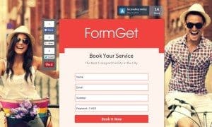
Ditch the Homepage For Landing Page
As dramatic as it may sound but a growing class of webmasters and designers in 2017 ditched the homepage for a landing page. Their marketing campaigns brought the visitors to a tailor-made landing page rather than dumping them to a generic home page.
The tactic is tremendously effective in boosting conversions for a number of reasons. A landing page doesn’t have all the distractions that a home page has, for example, a navigation bar, blogs section, news section, image slider, etc. As you trim down the distractions and harp about the main offer, chances of conversions are proportionately higher.
While home page presents a broad view of your products and services, a landing page, designed for visitors of specific demographics, age or location connects better because of its focus on a single topic. It’s the instant connect on a landing page that makes it more productive for driving conversions.
Last Try With Value-based Exit Overlays
If you are an Indian consumer, haggling is in the DNA. In physical stores, you must have seen how a nifty salesperson senses a tipping point when you bargain and adds a little more to the offer to crack the deal. The tactic can really work and often works if the add-on offer is tempting.
Web designers can ape this “deal-making” salesperson in the online world with Value-Based Exit Overlays. You can dole out a freebie, a discount, or free shipping as and when your lead is about to leave the website.
This is akin to taking a second shot at conversion and must be free from “Conditions Apply” if you seriously wish to stop the visitor from bouncing off.
Strike Balance Between Conventions & Trends
Remember, the design and UX elements detailed above are transient and may give way to an even better practice. To really the ace the conversion process, you ought to strike the right balance between basics and trends.
For example, there are certain principles such as the Rule of Thirds, the F-layout, the 8-second rule and most importantly the KISS concept, which form the backbone of visual and UX features of a site. While experimenting and innovation is necessary, these guidelines must inherently take space on your website.
Final Word
The manner and pace at which UX firms have evolved provides new opportunities, and at the same time, throws challenges for webmasters to pick the trends and respond in time.
The list of trends, I have covered in this post, is not exhaustive but aptly sums up the design and UX tweaks that hit big time recently. While the dynamics of digital marketing gives little time to relax and adapt, these trends are there to stay for some time.
So, you can try out these tested strategies on your own site and on your clients’ site, and check if the results testify all the hype and excitement surrounding them. You can begin with a couple of changes, track the impact it makes on your conversion, and then follow up with the entire list to maximize your gains.


2 Comments
Why Website Design & Development is Important and How WebuThinks Can Help
In today’s digital landscape, having a strong online presence is essential for any business. Website design and development play a crucial role in creating a professional and user friendly website that not only attracts visitors but also converts them into loyal customers. Here’s why it’s important:
1. First Impressions Matter: Your website is often the first point of contact between your business and potential customers. A well designed website creates a positive first impression, making visitors more likely to trust and engage with your brand.
2. Improved User Experience: Effective website design ensures that your site is easy to navigate, fastloading, and mobile friendly. This enhances the overall user experience, leading to higher engagement and satisfaction.
3. SEO Benefits: A well developed website is optimized for search engines, helping your business rank higher in search results. This increases your visibility and drives more organic traffic to your site.
4. Social Media Integration: Integrating your website with social media platforms enables seamless sharing of your content, boosting your social media marketing efforts and increasing your reach.
5. Content Marketing: A professionally designed website provides a solid foundation for your content marketing strategy. Engaging and informative content can be easily showcased, attracting and retaining your target audience.
6. PPC Management: A well structured website enhances the effectiveness of your PPC campaigns by providing a relevant and high converting landing page experience for your ads.
7. Local Business Promotion: For local businesses, having a website optimized for local SEO can significantly increase your visibility in local search results, driving more foot traffic to your physical location.
8. Online Reputation Management: A well maintained website allows you to showcase positive reviews and testimonials, manage your online reputation, and build trust with potential customers.
9. Web Design & Development: The core of your online presence is your website. Professional web design and development ensure that your site is visually appealing, functional, and aligned with your business goals.
How We Think Can Help
At WebuThink Pvt. Ltd., we specialize in delivering topnotch digital marketing and web design services that cater to your business needs. Our expertise includes:
SEO: We optimize your website to rank higher on search engines, increasing your visibility and attracting more organic traffic.
Social Media Marketing: We create and manage effective social media campaigns that engage your audience and promote your brand.
PPC Management: Our PPC experts design and manage high performing ad campaigns that drive targeted traffic and maximize ROI.
Content Marketing: We develop compelling content that resonates with your audience, building brand awareness and driving engagement.
Social Media Advertising: We create targeted social media ads that reach your ideal customers and generate leads.
Local Business Promotion: We help local businesses gain visibility in local search results and attract more customers.
Online Reputation Management: We monitor and manage your online reputation, ensuring that your brand image remains positive.
Web Design & Development: Our team of designers and developers create stunning, responsive websites that provide an excellent user experience and drive conversions.
Hello, This is really too useful information and have more ideas from yours. keep sharing many techniques. eagerly waiting for your new blog and useful information…nice…